Flat design is the most popular trend in UI design right now.
Superficially, flat design is simple:
- Don’t use gradients, shadows and textures
- Use simple shapes, bold colors and clear typography
I believe that a few prominent flat designs sacrifice usability and best practices such as consistency for the sake of aesthetics — and this is what I’ll primarily be talking about. But first, I’d like to discuss flat design in a historical context.
Flat Design’s Origin
"A designer knows he has achieved perfection not when there is nothing left to add, but when there is nothing left to take away."
- Antoine de Saint-Exupery
Skeuomorphic Design
Flat design is a reaction to its predecessor, skeuomorphism.
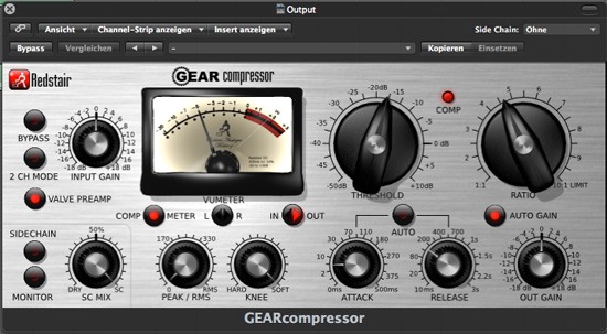
Skeuomorphs are user interfaces designed to look like real-world objects.
For example, the UI below resembles how a real-world audio compressor looks and functions:
 Source: Klaus Göttling
Skeuomorphs started in the 1980s as a way to ease people into computer interfaces.
Up until recently, Apple was skeuomorphism’s biggest champion, embracing the design philosophy in all of the company’s UIs and guidelines.
For instance, the old Apple Safari icon is instantly recognizable as a compass — it has shadows, gradients, and fine aesthetic details compared to its flat counterpart:

The Purpose of Flat Design
Flat design as a design approach strips away all the aesthetic frills, leaving behind only the essentials.
In a way, I see flat design as just another name for modernism, defined by a generation of UI designers who grew up with computers and have found skeuomorphism to be unnecessary.
No more gradients, drop shadows, and textures. Just beautiful typography, simple icons and shapes, vibrant colors to help establish visual hierarchies, and, most importantly, a deeper attentiveness on ease-of-use.
Flat design is driven by a desire for a more efficient and user-friendly interface.
That’s the idyllic purpose of flat design, but the current reality is so disconnected from it.
Issues with Flat Design
While there are plenty of great examples of flat design, there are also plenty of bad ones.
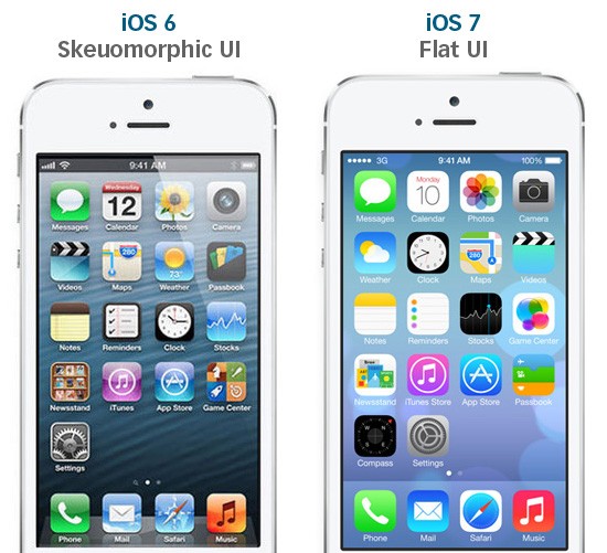
iOS 7′s UI Inconsistencies
Before the mobile operating system’s debut, rumors flew around: With new leadership from Jonathan Ive, iOS 7 was finally going to ditch skeuomorphic design and go flat.
And it did.
Take a look at the comparison below when iOS 7 was first announced:
 Source: designmodo.com
Skeuomorphic elements are gone. No more highly-stylized icons and faux wood trim.
What’s wrong with iOS 7?
It’s inconsistent.
The icons look glaringly out-of-place, as if they were designed by different teams (and they probably were).
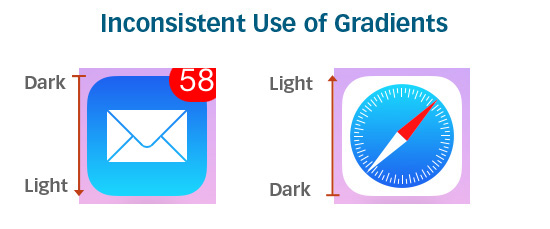
Some icons have gradients. Other icons don’t.
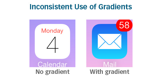
Of the icons that do have gradients, sometimes the gradients go in different directions:
Line thicknesses vary.
Symbolic representations of some icons are oversimplified and are sometimes meaningless. The Game Center icon, for example, is a group of colorful, glassy-looking circles:
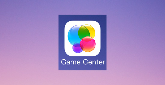
What does the Game Center icon mean? How does it relate to gaming? If there was a symbolic meaning behind the icon, it’s too obscure for most people to know, thus making it a poor metaphor.
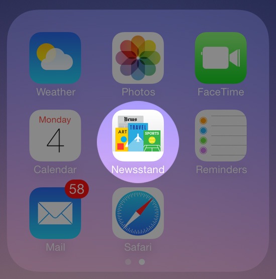
Other symbolic representations are overdone. The Newsstand icon, for example, is too complex and fine-detailed compared to its neighbors:
Consistency is crucial in creating a user-friendly design. Flat or not.
Usability Issues That Come From Being "Too Flat"
Okay, so no gradients, no textures, no drop shadows.
Keep things consistent.
And try to make it look modern.
That’s it? Piece of cake.
But there’s more to it than that.
Like any good UI, a good flat design should make usability the topmost priority.
Flat design aesthetics need to go hand-in-hand with usability. And if a decision had to be made between aesthetics and user-friendliness, the latter should be prioritized over the former.
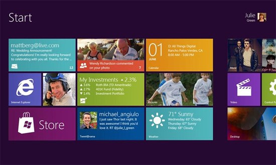
Functionality has been neglected in some UIs that have adopted a flat design. Take Windows 8 for instance:
 Source: mobiletechworld.com
Window 8′s UI is radically flat. Its brave use of bold colors and tiled Modern UI design are fresh, positive steps for the Windows brand.
But its main issue is usability.
With Windows 8, Microsoft tried to apply a tablet experience onto a desktop.
It didn’t work.
Window’s flat Modern UI (formerly known as Metro UI) is not intuitive for someone using a keyboard and mouse. According to Soluto’s Monthly Insights Report, between 44-60% of all Windows 8 users (desktop and tablet) are opting for the old interface over the Modern UI option.
Though flat design is supposed to make things easier, many people still find the old interface more user-friendly.
Jakob Nielsen ran usability tests on Windows 8 and noted several issues with its UI. The main issue Nielsen found was how the operating system’s flat design made it hard for users to know if things are clickable or not.
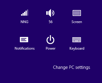 Source: nngroup.com
While the new Windows 8 icons are elegant and clean, they don’t appear actionable. Without a gradient, shadow, or just something that makes them distinctive, it’s hard to tell what’s clickable and what’s not.
Flat design can sometimes be so flat that it hurts usability.
If a user interface is "too flat", actionable elements can be lost in a sea of flat elements that all look the same.
There are even some concerns with iOS 7′s Control Center being "too flat":
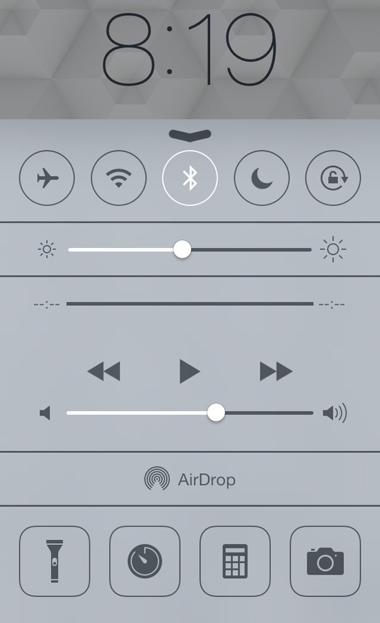
Without any good visual hints, it’s not obvious which objects you can interface with.
Solution: Almost-Flat Design?
So how do you remedy issues with flat design? Almost-flat design.
Almost-flat design is an approach that chooses flatness only when it improves usability. It doesn’t categorically say or imply that gradients and drop shadows are evil.
Almost-flat design permits subtle shadows and gradients to create dimension, distinction, visual hierarchies, visual cues, and boundaries.
Gmail’s Almost-Flat Design
Clean and consistent, Gmail’s recent UI redesign is easy on the eyes. It’s clear that Google’s designers love flat design — they’ve been moving towards flatter and flatter UIs as of late.
 Source: idownloadblog.com
However, hover your mouse over a button, and you’ll see the hover state has a slightly different color gradient as well as a useful tooltip:

These subtle aesthetic effects give users visual cues that the object is important and that it is actionable.
Users instantly recognize buttons in Gmail as clickable or tappable without the need for over-the-top embellishments ala skeuomorphism.
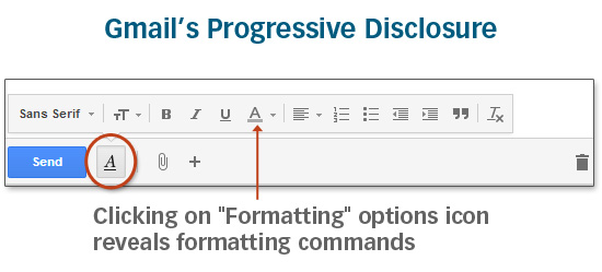
Crucial interface elements are easily accessible. There’s no need for twenty buttons to be visible at once because Gmail’s UI employs progressive disclosure intelligently:
The Future for Flat
Gmail’s interface is exactly what flat design is supposed to be:
- User-friendly
- Consistent
- Clear
iOS 7′s and Windows 8′s versions of flat design often sacrifice usability and well-established design best practices for flatness.
To be fair, both Apple and Microsoft are listening to criticism.
Before iOS 7′s release, Apple addressed some usability issues such as updating the slide to unlock function with an arrow pointing to the right to gives users a better visual cue, and they have tweaked the color gradients for the Safari and Mail icons so the operating system’s app icons are more cohesive.
And Microsoft just released Windows 8.1 which will allow users to bypass the Modern UI interface entirely, going straight to the desktop version instead.
Ultimately, good design — whether it’s flat or not — should aim to address problems for its users through clear visual communication, efficient design, and user-friendliness.
Related Content
About the Author
 Rick Debus is the founder and CEO of Signazon.com, a national e-commerce printing company based in Dallas, Texas. With over 15 years of web design and development experience, he’s passionate about bringing unique and innovative solutions to the Internet. Connect with him on Google+.
The post When Flat Design Falls Flat appeared first on Six Revisions.