
Advertise here with BSA
Over the past year, we’ve made great strides towards improving conversion at our startup, Docebo. What we do at our startup is help companies deliver e-learning solutions through a web interface and a WordPress plugin.
Because of our recent efforts in improving our conversion rates, we now have a fairly good idea of who lands on our homepage, and whether or not they’re likely to convert and becoming a user.
But it wasn’t always like that for us.
Now we take the view that knowing about our website visitors and users leads to the best conversion rates, and we’re continually giving our design and development teams new challenges of trying to find more ways to do that.
In our search for better conversion rates, and through many trials and errors, we’ve discovered plenty of different ways to increase signups on our platform.
I will share to you how we did it.
Optimize Ads Based on User Behavior Trends
It’s easy to pour money into pay per click (PPC) campaigns over at Google AdWords and Facebook advertising to drive traffic to our site.
However, it’s much harder to quantify what they’re giving us back for our money.
It’s also difficult to determine how to optimize our ad spending for value and quality, rather than just page views.
Search engine marketing (SEM) is a full time job, and it’s one that most startups don’t have the time, or perhaps even the resources, for.
Bid Management Tool
So how could we optimize our search engine advertisement spending without breaking the bank?
We got help in the form of software.
With the same amount of spending, we nearly doubled conversions using a bid management software. In short, bid management software automatically adjusts your PPC marketing campaigns based on which combinations of keywords and ads are converting the best.
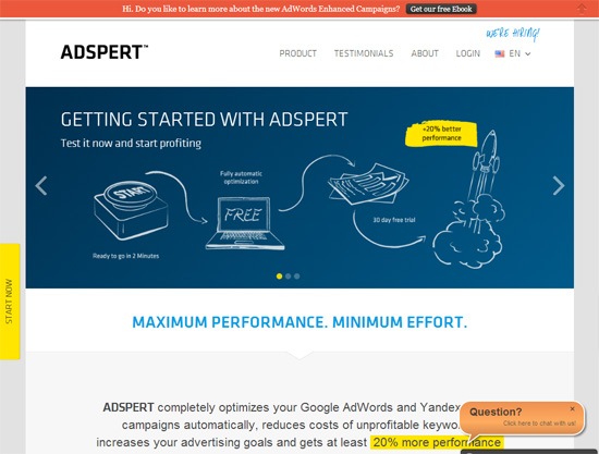
We tested several, and we eventually settled on Adspert. It only took minutes to sign up and the dashboard was fairly self-explanatory.
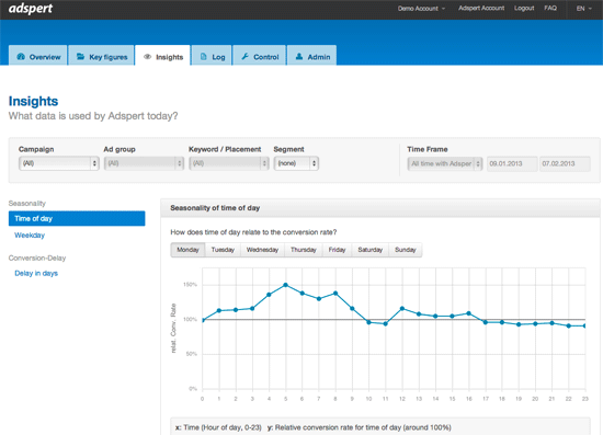
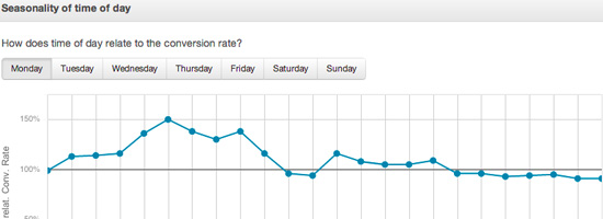
Once you’re in, the software hooks up with your Google account to download all of the data on campaigns and then sits in the background, making automatic adjustments to bids to reduce campaign spend by 20%.
It also factors in seasonality, changing bids depending on the historical data for particular dates or time periods.
Look for a solution like ours if you’re unhappy with the results of your ad campaigns, or if you think you can get better performance for the same amount of money.
The Results
The results of using bid optimization were fairly startling.
In the weeks after beginning to use the software, our new visits were up by 10% and returning visitors up by 20%.
By tweaking keywords and placements automatically, our bid management software also had a direct impact on the quality of the visitors that found us through PPC, with a 50% increase on page visit duration.
It’s important to note that although we’ve had great success with PPC advertising, I’d like to think it’s because we don’t just stop after the visitor lands on the site.
That’s because for a startup like ours, getting signups is what matters the most. Even with a high amount of traffic but very poor conversion rates, our advertising would not be sufficient.
We prefer to work with information handed to us by users when they engage or convert on the site. We want to know about our site visitors as much as we can.
Engaging Site Visitors and Users
If we’re paying to acquire visitors, it’s important to us that the visit isn’t wasted. This is where we begin to make a proactive effort to understand what our users want.
Online Surveys
Our most "in-your-face" method of learning more about our site visitors is using surveys — something often used by businesses for market research, and then subsequently forgotten as the customers begin to arrive.
But us, we try to hit visitors with surveys to understand why they’re behaving as they are on the site (in conjunction with several other methods which I’ll discuss later on).
If someone isn’t performing a conversion activity, we want to understand why — a train of thought that eventually leads to gaining a much greater value from our ad spend than just thinking "Oh, the target was wrong, let’s change the keyword."
SurveyMonkey is undoubtedly the brand leader in this space, but we chose FluidSurveys, which is pretty easy to set up and offers powerful logic options so that we can fine-tune each survey depending on the previous answers.

Instant Messaging and Live Chat
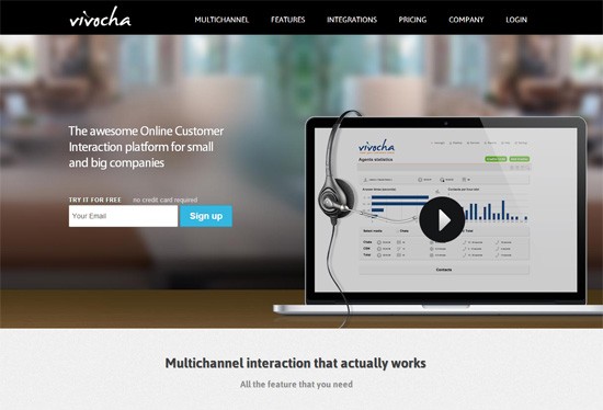
We also use Vivocha, an instant messaging widget that pops up on the site to offer help when customers match the profile we select.
It’s commonly thought that live chat widgets like Vivocha are a sales tool, but we’ve tried hard to make it into a customer research tool instead.
All feedback received through the widget is cataloged and prioritized so that we can keep track of what’s being asked.
For instance, we noticed that many users communicating through Vivocha were asking for web conferencing integration. That’s an important trend in visitor feedback that we may not have picked up on through surveys, because it’s a spur-of-the-moment, unadulterated thought visitors had while browsing our site that may never have been conveyed any other way. (Subsequently the conferencing integration was added to our development pipeline.)
Not only does live chat lead to incredibly useful feedback, it also feels more natural to our users too. Live chat is the equivalent of a store assistant approaching as you browse their store, compared to surveys that are more comparable to someone knocking on your door to ask questions.
In fact, we were so impressed by Vivocha that we integrated it into the Docebo API, allowing our clients and trainers to chat directly with their members of staff as they navigate the online training environment.
Tweak the Website’s Design for Our Users
We try to understand our users by monitoring what they respond to best.
Thanks to a host of young startups, A/B testing has moved from something reserved only for big brands into something that all of us can use to quickly and easily test what site visitors are looking for when they land on our site.
It is quite simply the most efficient way to know more about our website visitors.
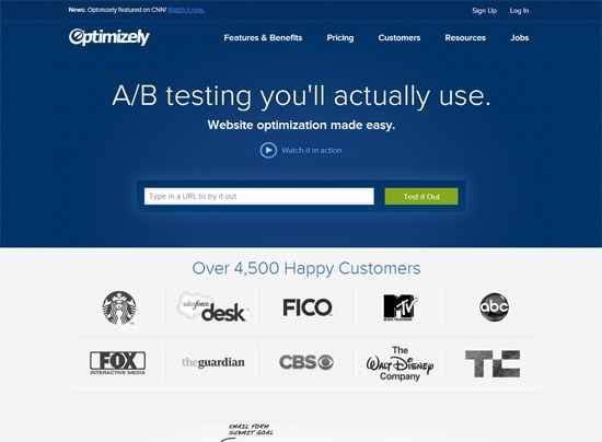
We’ve used Optimizely, but Visual Website Optimizer seems equally popular with startups.
Those of a more technical mindset can use easy-to-implement multivariate solutions such as Split (Rails gem) or the Django Experiments framework. These are slightly different from A/B testing but they have the same goal, which is to improve the user interface.
Identify Common Conversion Activities
The best way to increase conversions for businesses is to map out the steps that a customer takes from their signup to their payment.
That means understanding how a visitor is using the app — and what value they’re getting from it — which is generally measured using engagement.
Lincoln Murphy’s Common Conversion Activities (CCA) are how we measure behavior within our app.
We list down what we expect our visitors to do, and then measure whether they’re behaving as we think that they should.
Murphy defines Common Conversion Activities (CCA) as:
"a set of story-driven actions defined by falsifiable hypotheses that, when completed as a set during the trial, lead to conversion."
Essentially, this means defining a broad hypothesis such as, "If we can produce immediate results, the prospective customer will pay" and marking the steps required to reach that point, whether it’s sending an email, uploading a training course, creating a user, or something else.
Above all, we focused on designing our app so that customers realized value from it as soon as possible.

For example, it’s commonly advised that users should be guided through a set of steps based on a functional view of the software; e.g., a user must provide one detail before they can proceed to an action.
What we realized was that this UI flow is limiting. Sometimes, to get users to engage straight away, we need to hack the process so that the value is immediately clear without a bunch of steps in between.
One of the clearest ways you can see this in our system is the offer of pre-written training packs in a marketplace as soon as you sign up, which removes one of the biggest barriers in online training delivery: The creation of the materials.
It’s the same reason Apple suggests apps for beginners and PC manufacturers bundle software: Nobody likes to buy something that they then aren’t sure what to do with.
It makes an instant difference to UX and conversion when trial users get down to experiencing the value of the system for what it’s good at — delivering training — rather than getting stuck because they don’t have material at hand.
By identifying CCAs in this manner, we managed to do away with complex signup flows and replace them with a welcome process that immediately drives the user towards their e-learning goals — and also towards conversion.
Don’t Ever Underestimate the Power of Email
It’s easy to get bogged down in the minutiae of what’s happening on your main website. There’s an assumption that what happens there is what matters the most, so that’s where the time should be spent.
For many types of business, that’s a false assumption.
Any SaaS company like ours that maintains a lead list — whether those are potential customers, expired users, or some other group — needs to pay attention to how those leads are nurtured.
For a start, we worked hard to make sure we maximized the thousands of people who have signed up to try Docebo in the past. We told them about new features, we alerted them about best practices, and we’ve offered them free time slots to benefit from our e-learning experts.
Then, we tried to make sure that we were maximizing the touchpoints available. In one example, we sent former users a friendly email to tell them about three new features we’d added to the Docebo learning management system (LMS).
We learned quickly that this should have been three emails spaced out over 2-3 weeks to maximize the chances that our communications were being sent.
When we started looking at the volume of emails being sent, we realized that huge opportunities were being lost to convert as we communicate with our users.
In some communications, we hadn’t included the website address as the most distinctive link, which meant we were clearly missing opportunities to drive people who had an interest in our solution back towards where we wanted them.
Integration with Web Services and Products That Our Users Love Using
In recent months, we’ve been making a big development push to get involved in other areas of our customers’ lives.
For instance, we now know that many of our users are existing users of CRM, ERP and content management tools. So a massive part of our conversion strategy has been around the development of third-party integrations, helping Docebo to become not just a learning management system, but a wider ecosystem that allows us to talk to users that are not yet e-learning experts, but that can benefit from e-learning integration with a third party.

The rationale behind this, of course, is that when users begin to link up one software product with others, it becomes a lot harder for them to let it go. This is the Internet equivalent of how reluctant most of us are in messing around with our TV, DVD player and set-top box once it’s all set up.
API
Our first step was to create an API, which allows web developers to integrate Docebo into their own sites to any degree they require, helping other developers to get more value from the product than just with our app alone.
However, API integration wasn’t a panacea. Many customers simply couldn’t spare the time to build custom integration.
Therefore, we’ve also focused on providing users with off-the-shelf integration, so developing an "app store" of sorts has been a critical part of our strategy so far.

WordPress Plugin
We recently launched a WordPress plugin that integrates an existing content management system with our e-learning solution.
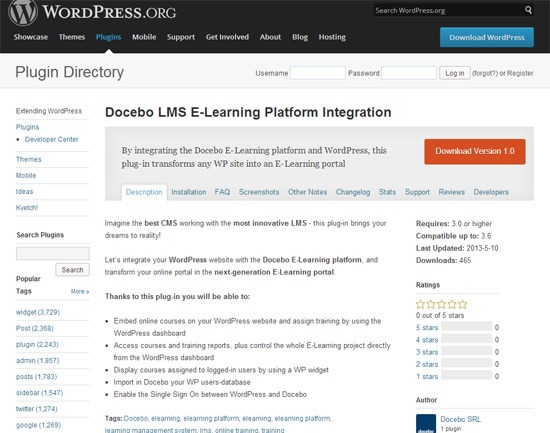
Based on the most recent results, integrating with existing solutions like WordPress is a track we’re going to continue down on.
Results of the WordPress Plugin
Since we released the plugin, we’ve had 300 new Docebo installations from users who want to turn WordPress into an e-learning solution.
We’ve gotten roughly 200 new customers from those. It’s a small start when viewed against our overall signup figures, but the traffic numbers are continuing to grow, with the number of people discovering the special WordPress landing page via other sources such as Facebook and the WordPress site itself increasing since the launch of the plugin.
We also believe that the traffic arriving via WordPress is higher quality.
The visitors from WordPress go to more web pages and spend over 1 minute longer on the site on average than our other non-paid referrals.
We’re hoping for similar (or better!) results from our next web service integrations, this time with video conferencing systems (i.e., Adobe Connect and Big Blue Button).
Conclusion: Know Your Users, and then Build Your Product for Them
We’ve improved quite a lot of things in recent months, but our overriding focus for the near future will still be around knowing our customers and figuring out how we can tweak their experiences for the highest conversion.
The strategies and tools that I discussed here have helped Docebo grow to over 500,000 users.
And we’re still discovering new things about them every day.
If you’d like to learn more about Docebo, check out our website.
Related Content
About the Author
 Jacopo Mauri is a natural born communicator, in love with everything related to writing and tech and with expertise as freelance journalist writing about technology and videogames. He’s an experienced marketer and has worked for companies including Nintendo Italy and Microsoft Italy’s official street marketing agency.


